How not to use the logo
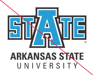

Don't reassign colors to the University Logo.
The University Logo was designed to consistently represent Arkansas State University. Proper use, including color and stroke order, is necessary to achieve that goal.


Don't distort the University Logo.
It is imperative to maintain the proportions of the University Logo in order to consistently represent the institution. To resize the University Logo, simply hold the ‘shift’ key to achieve desired size.





Don't reposition, resize, separate or in any way change the components of the University Logo.
The University Logo was designed to be used as a unit. Special consideration was given to the various uses of the logo, and the relationships of its components. As such, neither its components nor their relative position or proportional size should be altered in any way.

Don't apply the University Logo to a background not providing enough contrast.
When the University Logo is to be applied to a background color field or colored paper stock, the appropriate version must be used. This will provide greater contrast and improve readability.

Don't sacrifice legibility.
When the logo is reversed out of a photograph or another background, it must do so in an area of the image that does not compromise its legibility.

Don't create other one-color variations.
The one-color version of the University Logo must only appear in black, white, red or in special circumstances can be produced using metallic inks or foil. See “Approved Color Variations” for details (p 10). For foil stamping questions call 870-972-3820.
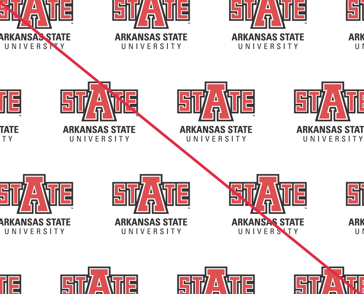

Don't use the University Logo as a wallpaper background.
Wallpaper patterns are not an acceptable application for the University Logo. Using it as a background design element dilutes its importance and can violate necessary clear space requirements. Applying color, patterns, images, or type to the interior or exterior of the university signature is strictly prohibited.
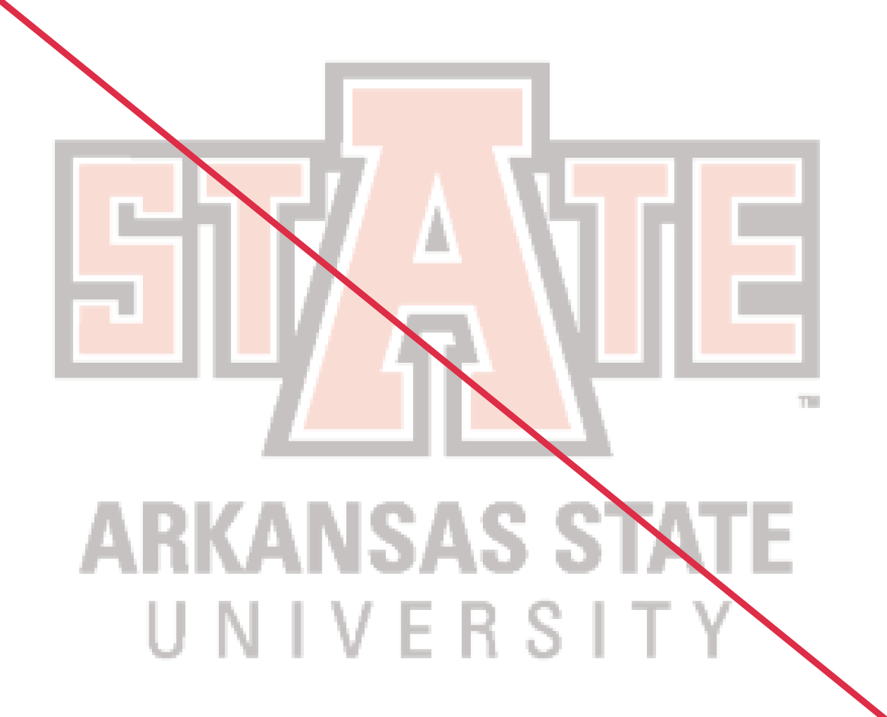
Don't 'ghost' (screen, watermark) the University Logo.
Unfortunately, the nature of our red color when water-marked appears pink. Thus, it is unacceptable to use in this manner. It is, however, permissible to watermark a one-color version if a proper request has been made to Publications & Creative Services and it is deemed appropriate.

Don't use pixelated or low resolution files of the University Logo.
Only use the approved versions of the University Logo that you are able to download from astate.edu/pcs. Downloading images from other sources may result in files that are poor in quality.
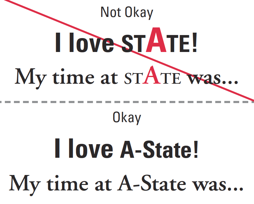
Don’t key the University Logo in text to substitute for the institution’s name.
This usage in its simplest form can only be described as “re-drawing” the University Logo and is therefore not an approved usage. Use the university name “Arkansas State” or “A-State” in body copy.
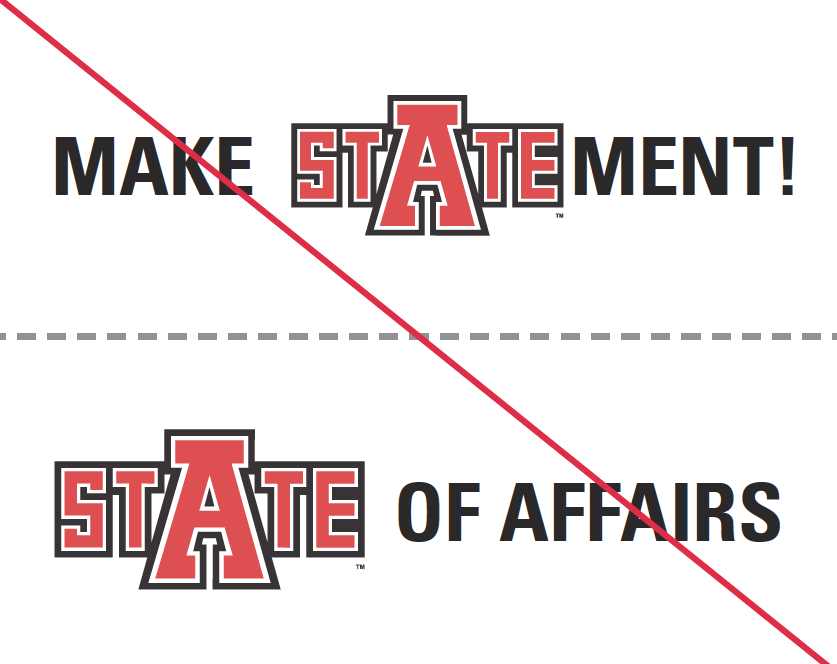
Don’t use the University Logo as a word or portion of a word.
It is not permissible to use any part of the University Logo to substitute for a word, group of words or portion of a word in headlines, theme art or body copy. Some read the STATE logo as the word ‘state’ and others read it as ‘A-State.’ Therefore this usage can create confusion in an intended message.

Don‘t place objects or elements on top of the University Logo or any of its Marks
Overlapping items on top of university marks decreases their readability and is therefore prohibited.
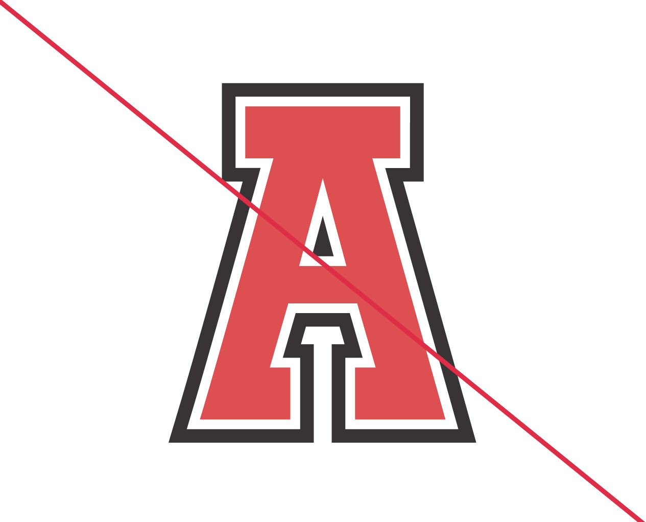
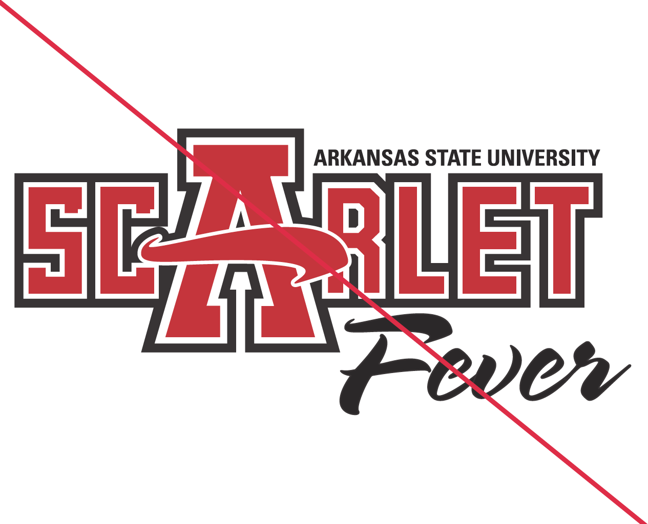
Do not separate the ‘A’ from any University Mark.
It is never permissible to separate the ‘A’ from the logo to use as a graphic. Also, reconstructing the logo and it’s letters or additional letters to form new words that are meant to resemble the look and proportions of the STATE logo is not allowed.


